


FACT CHECK: Is autism really skyrocketing?

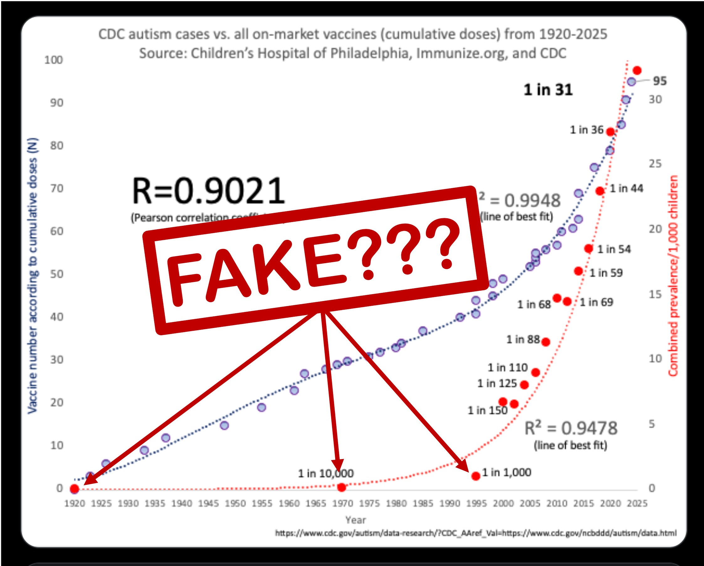
This weekend, a viral post on X claimed to show proof that rising autism rates are caused by increasing vaccine burden.
Data-minded people had a fun weekend out-competing each other to see who could find the silliest time series that matched the autism curve. Because after all, correlation is not causation!
But I was more curious about the autism curve itself. Because the shape of this curve relies very strongly on three data points from 1920, 1975, and 1995. And those three values are so much lower than the data from after 2000.
So, epi-senses tingling, I went to the CDC website to graph the data myself. Spoiler alert: it does NOT look like this viral graph!
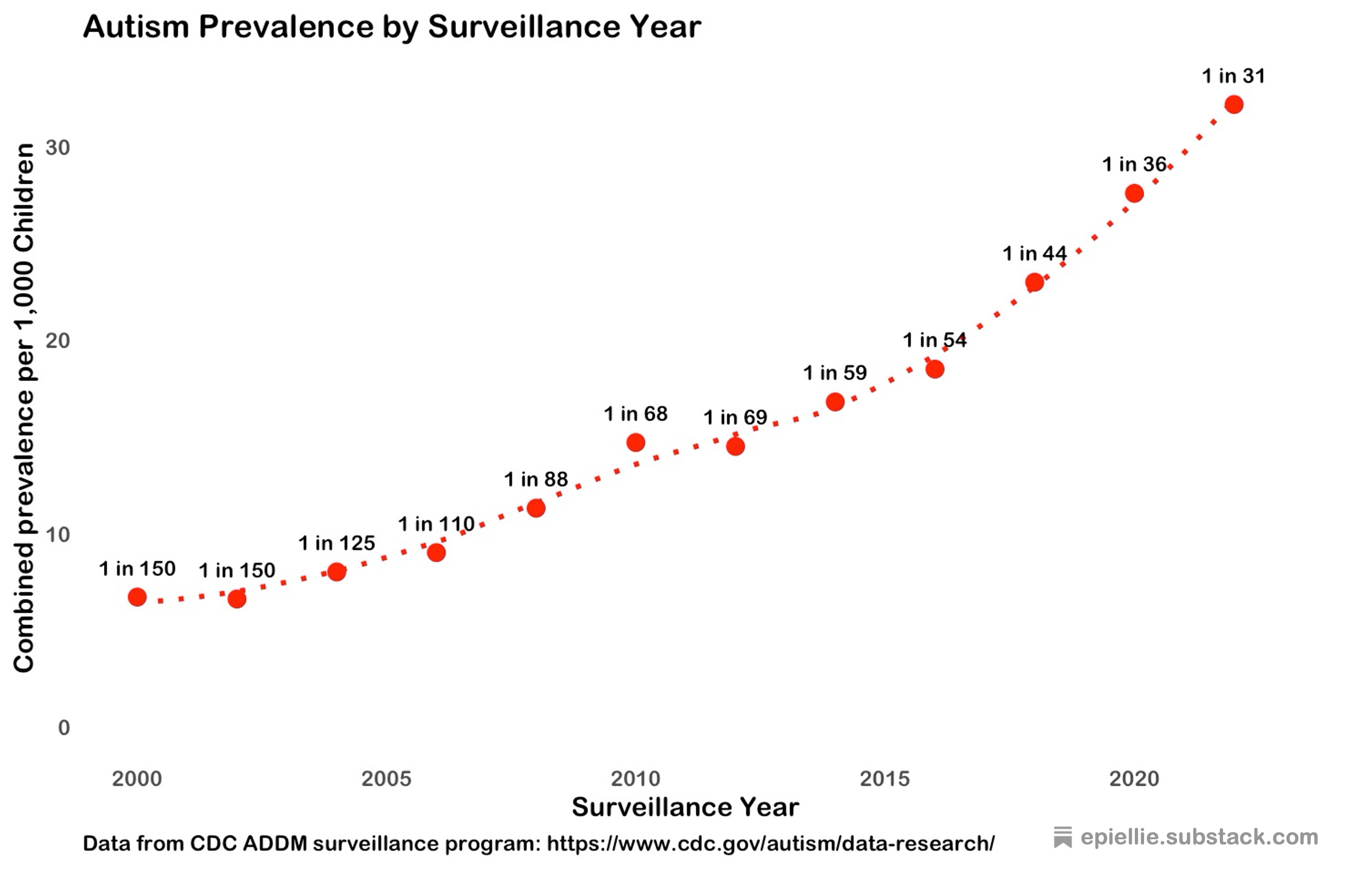
The CDC has been collecting autism prevalence data since 2000, through the Autism and Developmental Disabilities Monitoring (ADDM) system. That system relies on a series of a dozen or so sentinel sites which report their autism rates annual. The CDC combines these into a national estimate.
This data does show an increase in autism prevalence from 2000 to 2020. But it’s growth is nowhere near as explosive as it looks in the viral graph!
So what about those three extra data points that make the viral curve look so concerning? Can we trust that they tell us about the true shape of the growth curve?
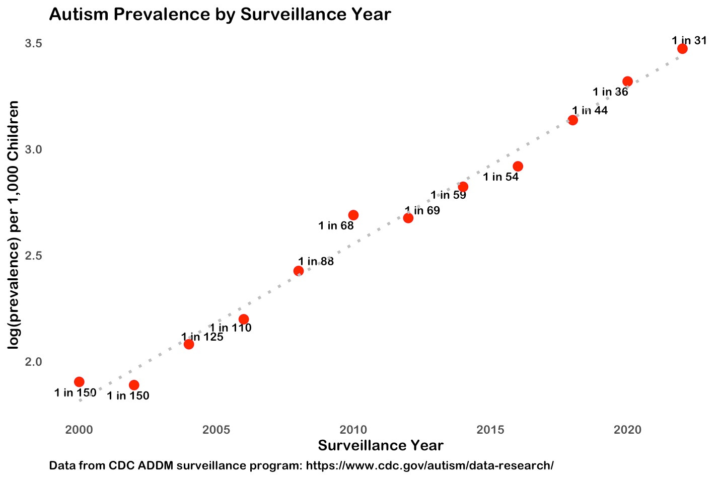
If the increase in autism prevalence is really exponential, then we should get a straight line if we plot the logarithm of the data.
And, when we plot the log from 2000 to 2020, we do get roughly a straight line (that dashed gray line is the best fit linear model). So maybe autism prevalence IS growing exponentially.
But do those three extra data points belong on that same exponential curve?
It sure doesn’t look like it! When we plot the log of all the data from the original graph, the pattern is completely wacky!
I don’t know about you, but I cannot see a single straight line through all those points. This tells us the three extra data points do NOT come from the same data generating mechanism as the CDC data.
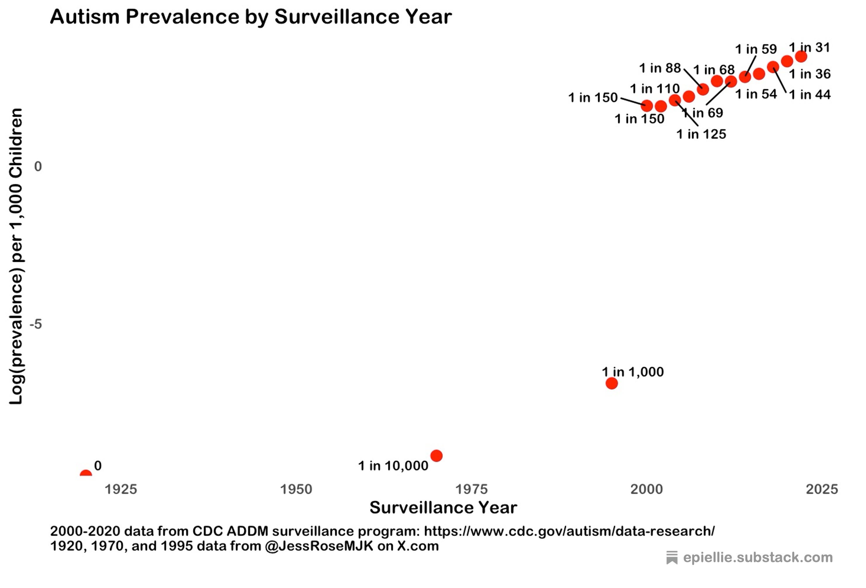
So where do those extra data points come from??
The original post doesn’t tell us. But looking through the comments it seems quite likely the value of 0 for 1920 was simply made up just to stretch the x-axis for autism to cover the full time range.
The 1995 data point is probably an extrapolation from a Department of Education report on the use of Special Education Programs in the 1990s. This tells us only 1% of children using Special Education Programs in the mid-90s had an autism diagnosis, and uses this to estimate a national prevalence of about 1 in 1000. But autism had only been included in reports since 1992. It’s not at all clear that access to Special Education Programs reflects actual prevalence!
And the 1970 estimate of 1 in 10,000? This is the order of magnitude of a range of guesstimates (2-4 per 10,000) from a handful of studies from the 1960s and 1970s — as summarized in the introductory paragraph of a paper about how these prevalence estimates are probably wrong!! Not a reliable prevalence estimate!
BOTTOM LINE: Autism prevalence HAS increased from 2000 to 2020. And that increase MIGHT be exponential. But it’s nowhere near as explosive as that viral graph makes it look.
In the actual data that the CDC actually collected, autism rates have increased by about 5-fold since 2000. Not 10-fold. Not 100-fold.
This viral graph does not prove that vaccines are causing autism rates to increase. It doesn’t even prove what that increase looks like.
And we cannot possibly even begin to study why autism rates are increasing unless we have an accurate picture of how they’re increasing!
Thank you. If you only could have kept going. What we should all want to see is the diagnostic criteria for autism over time.
Thank you, Ellie.
1. I'm amazed you took the time to investigate apparent nonsense on X
2. Of course, association is not causation. No matter how well a curve for an exposure (vaccines or otherwise) fits a curve for autism, that cannot show that the exposure caused autism.
3. BUT: the key thing about the CDC autism reports is that each "prevalence" value is specific to one birth year. That is, they are birth year prevalence, not plain prevalence. Birth year prevalence is the best method we have to estimate true case incidence. (See e.g. the WHO' GBD project.) We should use birth year on the X axis.
4. And, the set of CDC reports show an exponential increase of birth year prevalence, hence incidence, of 7.6% per year over birth years 1992-2014. That is very meaningful. Of course, it does not implicate any specific cause or set of causes. It is an essential first step.