


The Texas measles outbreak: How bad could it get?
An epi model

Texas is currently having a measles outbreak and it seems to be growing fast. On January 23rd, only 2 cases had been reported. By February 11th, the number of cases was up to 24.
As outside observers, how do we make sense of this outbreak? Is it growing faster than expected? Slower? How big will it get? How many people might die? These are all questions that epidemiology can help us answer — without having to wait for more people to get sick!
An important part of infectious disease epidemiology is making predictions about what an outbreak in a particular place and time might look like, if we did (or didn’t!) do anything to stop it. To do this, we use a tool called mathematical modeling. If you’re curious to learn how that tool works (or how I got the numbers in this post) check out the explainer post.
If you just want the numbers, let’s start with the graph.
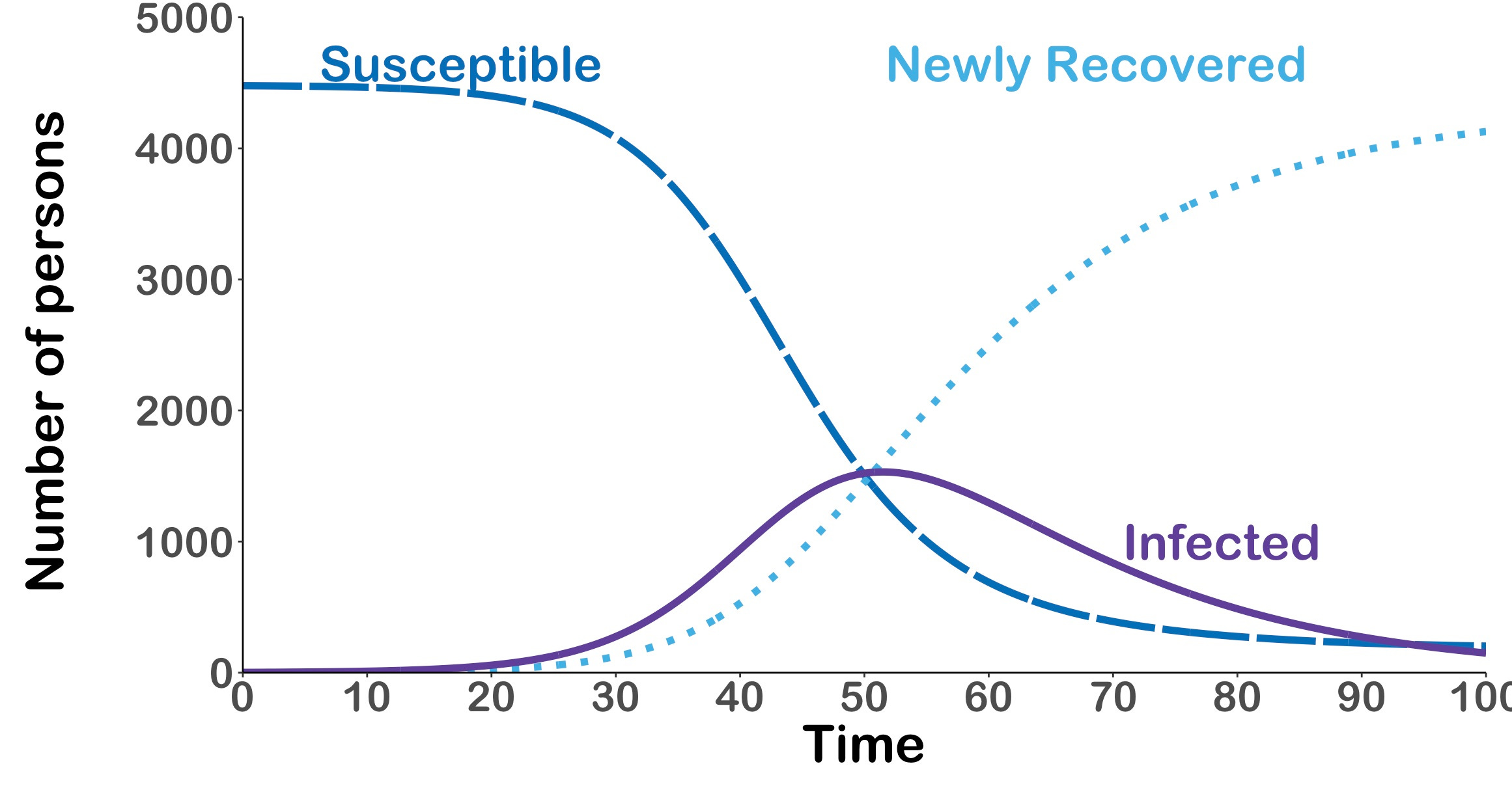
What are we looking at here? This plot shows us how the measles outbreak in Gaines County Texas could grow over the next 100 days (give or take — Day 0 is Jan 23rd). The dashed dark blue line shows us how the number of people who are susceptible to measles could change over time — we start with about 5000 people (roughly the unvaccinated population of Gaines County), and in our model this gradually reduces to only 202 people!
This tells us that if we do nothing to stop the outbreak, and no one changes their behavior because of it (and also if our model is right — more on that in a minute!) almost everyone who could possibly get infected will get infected!
What about the other two lines? The solid purple line shows how many currently infected people we might expect on any given day. This peaks at 1531 people on Day 51, which is March 15th. I hope Gaines County has enough hospital beds!
Finally, the dotted light blue line shows us how many people are expected to recover over time (note, that in this model, we’ve assumed no one dies from measles; that isn’t true!). Eventually, this is almost all of the susceptible people and we can use this as a way to get an estimate of how many total infections we expect. If our model is right, there could be 4128 total infections in Gaines County over the next few months.
But that’s if our model is right. And I’m going to tell you straight up: this model is wrong.
So why did I show you this? Because even though the model is wrong, the model is still useful! When I built the model, I made lots of assumptions (read more) to make the model simple. Almost all of these assumptions overestimate the amount that measles could spread.
For example, I assumed that people who have measles continue to go about daily life as if nothing has changed. Which is probably wrong. People with measles are sick. They probably don’t go to school, or to hang out with friends, or grocery shopping, or whatever. So, they are likely to transmit less to others than my model says.
But there are also a couple assumptions which might underestimate the spread.
For example, I assumed that everyone in Gaines County interacts with everyone else completely randomly. That’s obviously not true. People have family, friends, coworkers, schoolmates, neighbors, etc. Interactions aren’t completely random. And what’s more, they probably aren’t random in terms of vaccination status. People who are unvaccinated are likely interacting more with each other, whether in the same family, friend group, religious organization, or similar.
If the people who are unvaccinated only ever spend time with other unvaccinated people, our model would look different:
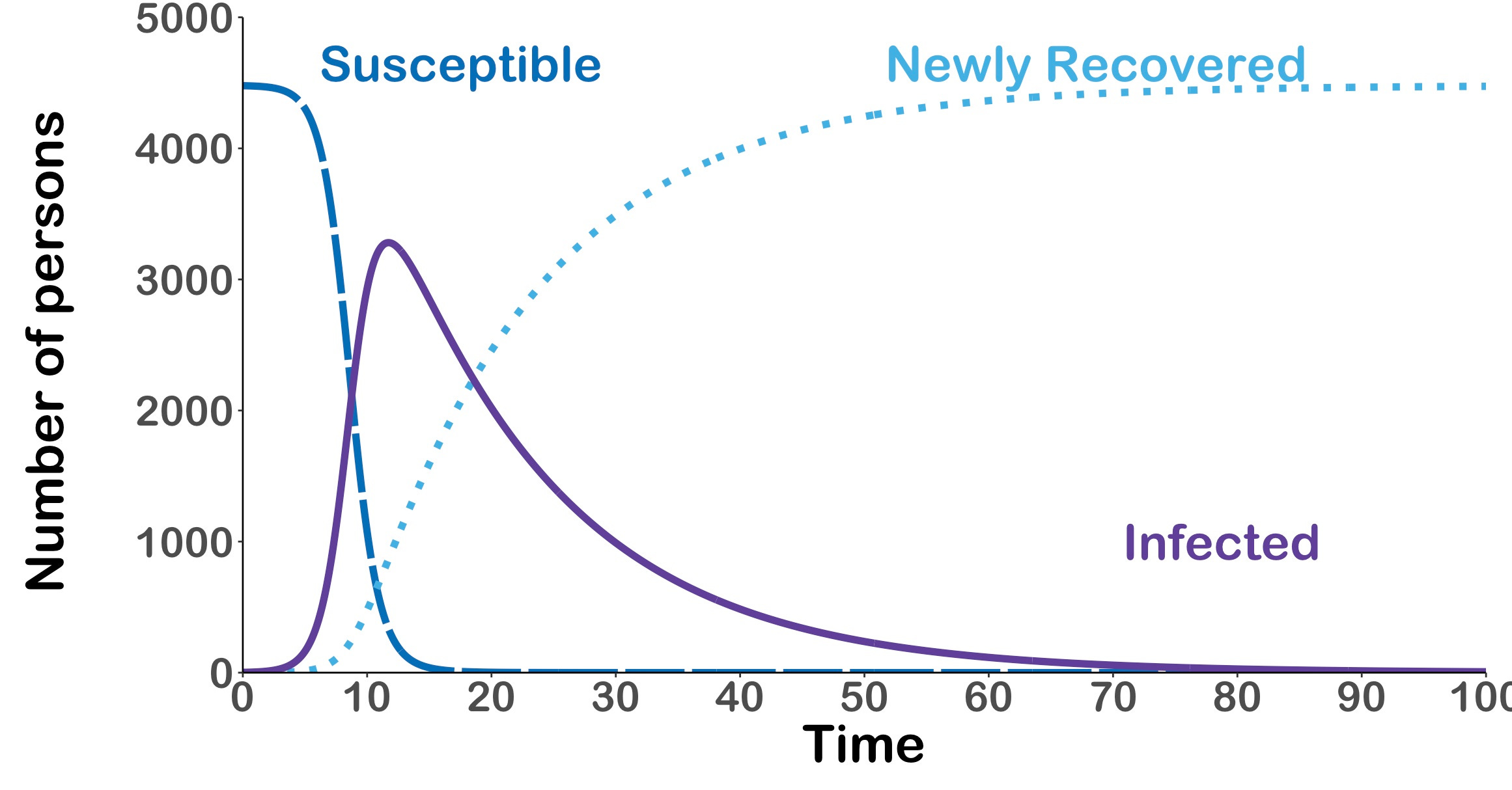
Instead of a maximum of 1531 infected people on Day 51, we would expect a maximum of 3280 infected people on Day 11! And absolutely everyone (give or take randomness) would be infected by the time the outbreak was over. Yikes!
But if the model can change so much, what is the point in building it? Two reasons.
First, we can use it to make sure we have enough resources and personnel available for the largest possible size of the outbreak, and we can vary the assumptions to get a range of plausible outbreak sizes.
Second, we can use it to evaluate how well (or badly!) we did at controlling the outbreak after it’s finished. We can even do this while the outbreak is happening.
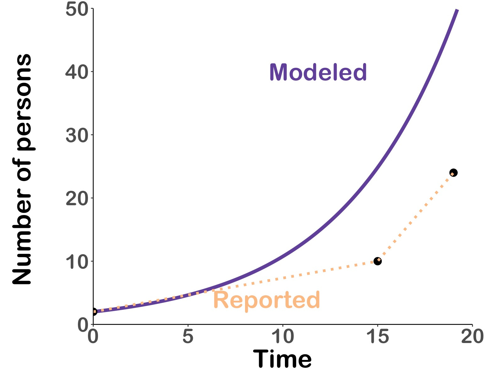
If we zoom in on the first 20 days of the outbreak, we can add the actual reported case numbers from the Texas Department of Health and Human Services for Jan 23, Feb 7, and Feb 11. And this tells us two things: the outbreak is definitely growing fast, but it’s also not growing as fast as it possibly could.
Hopefully Gaines County can get it under control without 4800 people becoming sick!
Thanks for this. Two questions. How do you know there are 5000 unvaccinated in the county? Is this an example for the model? Second is this: would there not be some spread outside the county?
I've got tons of real time movement data ontexas schools. I wonder if there's evidence of the kind of decrease in movement noted in the model discussion.